Your website probably looks fine.
That is exactly the problem. Fine is the most expensive rating a website can get, because fine does not get fixed. A broken site gets rebuilt. An ugly site gets budget. A fine site just sits there for three years, quietly losing you customers, and nobody can point to why.
Here's the thing: visitors are not grading your site the way you do. Research by Lindgaard and colleagues found that people form a visual impression of a web page in about 50 milliseconds. That is faster than a blink. Before anyone reads a single word you wrote, they have already decided how much to trust you.
And that snap judgment carries real weight. Stanford's Web Credibility Project found that when people assess whether a website is credible, the design look of the site was the single most mentioned factor, ahead of the actual content.
We run design audits for a living, on our own clients' sites and on sites agencies bring us under their brand. The same seven mistakes show up over and over, on sites that look perfectly fine. In this article, we'll walk through each one, what it costs you, and how to fix it. Let's dive in.
50ms
Time to form a first impression of a page
Lindgaard et al., Behaviour & Information Technology
#1
Design look ranked top credibility factor
Stanford Web Credibility Project
32%
Rise in bounce probability, 1s to 3s load
Google/SOASTA research
1. The hero says nothing
Open your homepage and read the headline out loud. Now ask yourself one question: could a competitor paste that exact headline onto their site without changing a word?
If the answer is yes, your hero is decoration, not communication. "Grow your business with smart solutions" tells a visitor nothing about what you do, who you do it for, or why you over anyone else.
Why does this matter so much? Because you have seconds, not minutes. Nielsen Norman Group's analysis of page-visit data found that if a page fails to communicate its value quickly, most visits end within the first 10 to 20 seconds. Visitors who make it past that window tend to stay much longer. The hero is what gets them past it.
The fix costs nothing but honesty. Name the service. Name the buyer. Name the outcome. "Senior web design for B2B companies that need the site to sell, not just look good" beats any amount of clever.
2. The page loads like it's 2012
Speed is a design decision. Every oversized hero video, every uncompressed image, every third-party script your last three marketing tools left behind is a design choice someone made, and your visitors are paying for it.
Google's research with SOASTA put numbers on the damage: as page load time goes from one second to three seconds, the probability of a bounce increases by 32 percent. Stretch it to five seconds and bounce probability goes up 90 percent.
So before you commission a redesign, run your site through PageSpeed Insights. We have seen sites recover meaningful conversion just from compressing images and removing dead scripts. No new design required.
3. Five CTAs, zero decisions
Book a demo. Start a trial. Download the guide. Subscribe to the newsletter. Follow us on LinkedIn. All above the fold, all shouting at once.
When everything is a priority, nothing is. A visitor faced with five equally weighted asks does not pick the best one. Most pick none.
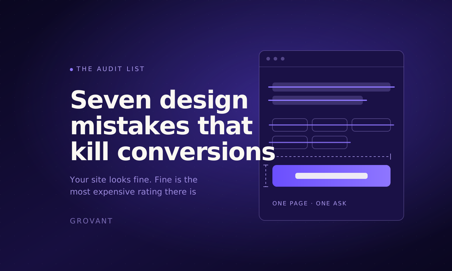
The fix is editorial courage: one primary action per page, stated in one verb, repeated consistently. Everything else gets demoted to a text link or removed. On our own site every service page asks for exactly one thing, and the button says the same thing at the top and the bottom of the page.
See the difference? A page with one ask reads like a person with a point. A page with five asks reads like a committee.
4. Forms that interrogate instead of invite
Every field you add to a form is a small tax on the visitor's patience. Most forms charge way too much.
Baymard Institute, which has tracked checkout usability for over a decade, puts the average online cart abandonment rate at roughly 70 percent. And their checkout research found the average checkout flow contains more form fields than users actually need to complete the purchase.
Lead forms have the same disease. Company size, industry, budget range, how did you hear about us. Do you need all of that to start a conversation? Or do you need a name, an email, and one sentence about the project?
Ask for what the first phone call actually requires. Collect the rest on the call.
5. Trust by decoration
Stock photos of handshakes. A wall of logos nobody can verify. "Trusted by industry leaders" with no names attached. Five-star badges from review sites you have three reviews on.
Visitors have seen ten thousand sites exactly like this, and the pattern now reads as noise at best and as a warning sign at worst. Remember the Stanford finding from the top of this article: people judge credibility visually. Decorative trust signals are visual, so they get judged too. And fake-looking trust is worse than no trust.
What works is specificity. A real project with a real outcome. A named person saying a verifiable thing. A screenshot of actual work. If you do not have those yet, say something true and plain instead. "We are a small senior team and we take a few clients at a time" builds more trust than a fabricated logo wall ever will.
6. Mobile as an afterthought
According to StatCounter, mobile accounts for the majority of web traffic worldwide, and it has held that lead for years. Yet most sites are still designed on a 27-inch monitor, approved on a 27-inch monitor, and only checked on a phone when a client complains.
The result? Text that wraps into a wall, buttons stacked on buttons, forms where tapping a field summons a keyboard that covers the field. The desktop site converts and the mobile site apologizes.
Pull up your analytics and check your mobile share of traffic against your mobile share of conversions. If mobile brings 60 percent of visitors and 25 percent of leads, you do not have a traffic problem. You have a design problem with a very clear address.
7. Redesigning by taste instead of evidence
This is the meta-mistake that produces the other six. The CEO likes blue. The new marketing lead wants it to feel more premium. Someone saw a competitor's site and now everything must be dark mode.
None of those are design decisions. They are preferences wearing a design costume.
A real design process starts with evidence: where visitors actually land, where they actually leave, what they actually click, which pages carry revenue and which just carry pixels. Then design fixes what the evidence indicts, in order of what it costs you.
What this looks like as a checklist
| Mistake | What it costs you | The fix |
|---|---|---|
| Vague hero | Visitors leave in the first 10 to 20 seconds | Name the service, buyer, and outcome outright |
| Slow pages | Bounce probability up 32% from 1s to 3s | Compress images, cut dead scripts, then redesign |
| Competing CTAs | Decision paralysis, fewer total actions | One primary action per page, one verb |
| Bloated forms | Abandonment before the first conversation | Ask only what the first call requires |
| Decorative trust | Reads as noise, or as a warning sign | Specific, verifiable proof or plain honesty |
| Desktop-first mobile | Mobile traffic that never converts | Compare mobile traffic share to mobile lead share |
| Taste-driven redesigns | Money spent, same numbers after | Audit first, redesign what the evidence indicts |
So, do you actually need a redesign?
Maybe not. That answer surprises people coming from an agency that sells design, but it is the honest one.
If your site is slow, your forms are bloated, and your hero is vague, you can fix all three without touching the visual design. That is a week of focused work, not a quarter-long rebuild.
A full redesign earns its cost when the problems are structural: the information architecture fights the buying process, the brand undercuts your actual positioning, or the site was built on something nobody can safely edit anymore.
How do you know which situation you are in? You look at the evidence. That is literally what a design audit is: a senior designer goes through your site page by page, finds what is costing you conversions, and hands you the ranked list. Ours is free, it takes a few days, and the list is yours whether or not you hire us.
And if you are an agency reading this with a client site in mind, we do the same work under your brand. Our white label web design guide covers how that engagement works end to end.